
In our last post we built a very simple canvas app using Forms, Galleries and our Service table. Forms are one of the quickest and easiest ways to build a simple CRUD application (Create, Read, Update, Delete), but they lack something in visual flair.
In the first post of this series, we talked about how canvas apps give you much more control over the look and feel of an application. Users have the ability to place a wide variety of different controls anywhere they want on the screen. Mobile-centric applications should make use of bigger controls, designed with finger touch in mind, rather than mouse and pointer.
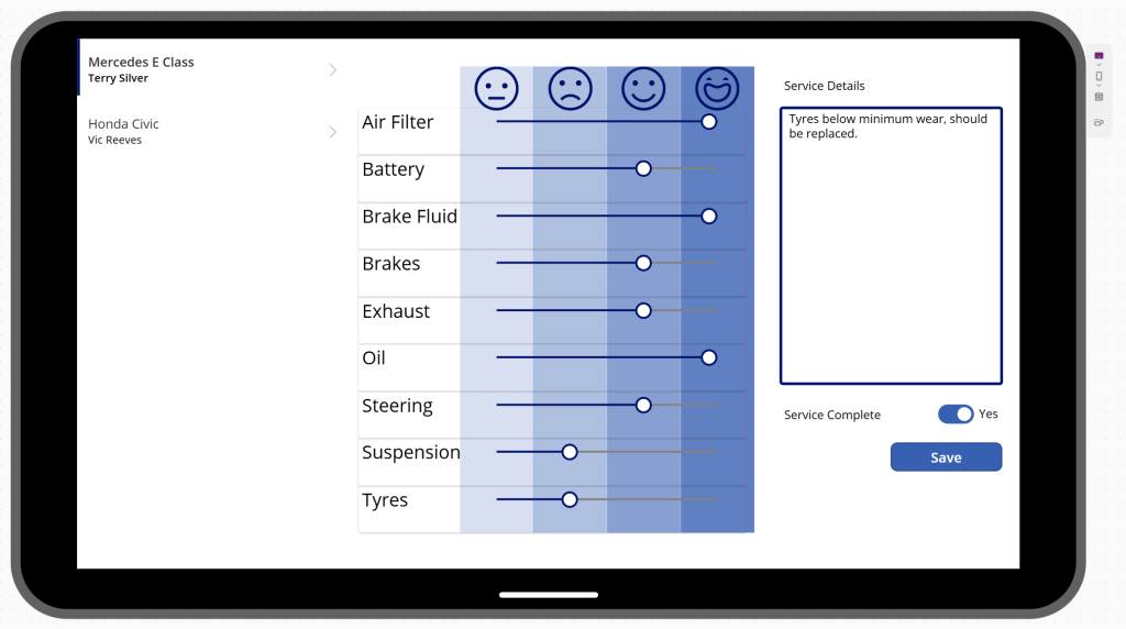
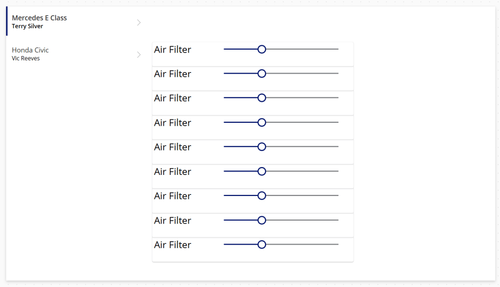
Instead of our Form, lets use custom controls to build the following:
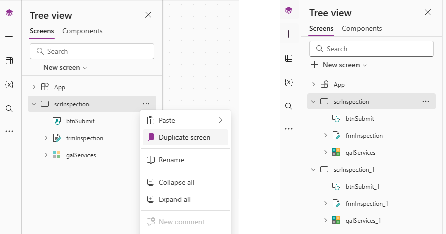
We begin by opening our Vehicle Servicing app created in the last post. Our intention is to remove the existing Form and replace it with a series of custom controls. If this makes you a bit nervous, you can always duplicate the existing screen if you want to retain your work.
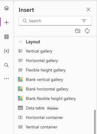
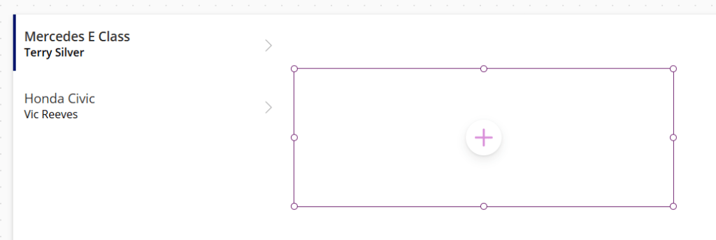
Delete the Form and Save button from the scrInspection screen – we want to replace this with a series of sliders for each test item, each test stacked one on top of the other. Our first step is to add a Horizontal container.
This adds a blank container to our canvas. When we add controls into this container, they will be ordered from left to right, because this is a horizontal container.
From the side navigation, we drag a Text label and a Slider into our horizontal container and observe the resulting orientation.
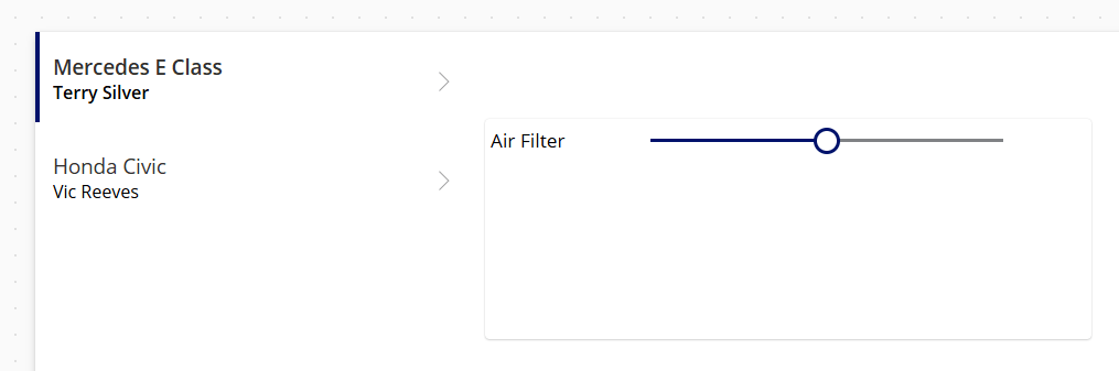
As mentioned previously, it’s good practice to rename our controls. I’ve set the following names:
- Horizontal container – hconAirFilter
- Text label – lblAirFilter
- Slider – sldAirFilter
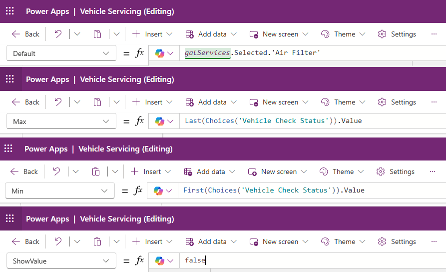
Next, we want to set some of the properties of our Slider control. Click on the slider and then refer to the formula bar to set the following properties:
- Default – galServices.Selected.’Air Filter’
- This sets the Slider value to the value of the Air Filter property of the currently selected Gallery item.
- Max – Last(Choices(‘Vehicle Check Status’)).Value
- This sets the maximum possible value of be the last value of our Vehicle Check Status Choice. The max value here is Replaced.
- Min – First(Choices(‘Vehicle Check Status’)).Value
- This sets the minimum possible value of be the first value of our Vehicle Check Status Choice. The max value here is Untested.
- ShowValue – false
- This is a visual option to prevent the Slider value being shown in a tooltip. We are using a different indicator here.
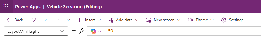
Next, select the horizontal container and set the LayoutMinHeight property to 50.
Now we have a horizontal container that contains a Text label and a Slider corresponding to our Air Filter property of the selected Gallery item. We want to recreate this arrangement for each of our test items.
First, we add a Vertical container to our canvas. Then we select our Horizontal container, and select the Cut option. Then we select our Vertical container, and select the Paste option to put our Horizontal container inside our Vertical container.
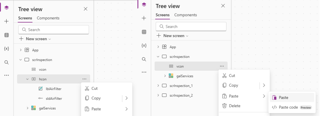
Once pasted inside our Vertical container, select the Horizontal container and select the Copy action. Next, select the Vertical container and select the Paste action repeatedly to create 9 Horizontal containers inside the Vertical container. The result should look like this:
 Power Platform Pete
Leave a reply to Working with APIs Part 1: Creating a test API – Power Platform Pete Cancel reply