
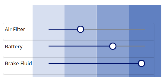
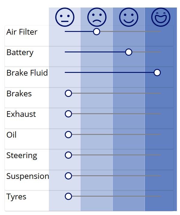
Earlier in the post we set the Toggle controls to hide the toggle value. Instead, we wish to use some sort of visual indicator illustrating where each test result stands on a sliding scale, something like this:
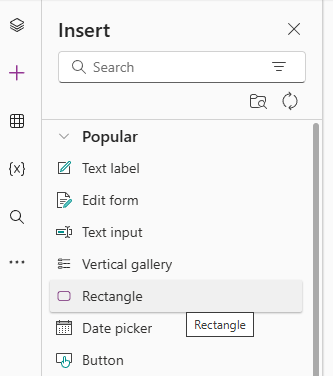
Let’s add the first column to our grid here. Add a Rectangle to the canvas from the components
Rename the rectangle as rectUntested and set the following properties:
- Fill – RGBA(56, 96, 178, 0.2)
- The first three number values here are a default blue shade. The fourth is the degree of opacity of the colour – this is 20% opacity.
- Width – sldAirFilter.Width/3
- Each column is the third of the width of the sldAirFilter Slider
- Height – vcon.Height + 60
- The rectangle will be as tall as our Vertical container, with just a bit more on top.
- X – vcon.X + lblAirFilter.Width – sldAirFilter.Width/6
- This will align our first column with the minimum value of the sldAirFilter Slider
- Y – vcon.Y – 60
- This will align our rectangle to fit with the bottom of the Vertical container with the overhang on top.
This should result in the following.

This next step is very important. Select our rectangle from the left hand component view, then select Reorder > Send to back. This puts our rectangle behind our containers. If this step is not done, the rectangle will block the Slider controls and they cannot be selected.

Now we have the first column in place, we can select the rectangle and select the Copy action. Then select our srcInspection screen and click the Paste action three times to generate the next three columns.
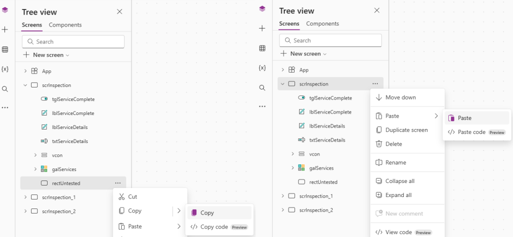
Rename the three new columns as rectUnsatisfactory, rectSatisfactory and rectReplaced and repeat the action to Send to back for each.
Update the following properties for each:
| Fill | X | |
| rectUnsatisfactory | RGBA(56, 96, 178, 0.4) | rectUntested.X + rectUntested.Width |
| rectSatisfactory | RGBA(56, 96, 178, 0.6) | rectUnsatisfactory.X + rectUnsatisfactory.Width |
| rectReplaced | RGBA(56, 96, 178, 0.8) | rectSatisfactory.X + rectSatisfactory.Width |
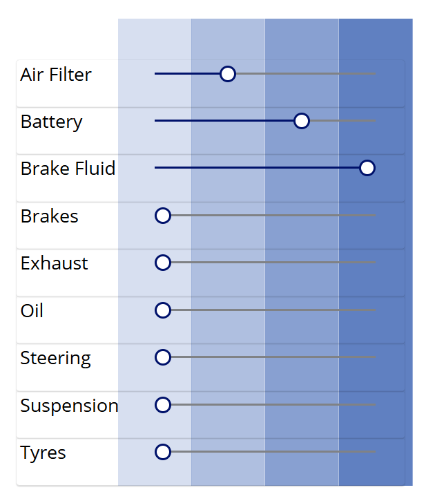
The Fill property is the same shade of blue as before, just progressively more opaque (40%, 60%, 80%). The X property is set the the rightmost end of the previous rectangle. This results in the following:
For a final flair, let’s add some indication icons to the top of our grid. I like using the Emoji icons, and am going to add them to represent the statuses as follows:
- Untested – Emoji – Neutral
- Unsatisfactory – Emoji – Frown
- Satisfactory – Emoji – Smile
- Replaced – Emoji – Happy
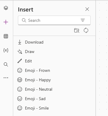
I’ll drag each into the header columns to give me the following:
 Power Platform Pete
Leave a comment