
Charts are a great way to add visual flair to your model-driven apps. It’s easier to comprehend charts than tables of figures – as the old saying goes, “a picture paints a thousand words”. Today we’re going to augment our LaRusso Autos app with two charts:
- Stock Value by Manufacturer
- Vehicle Sales by Month
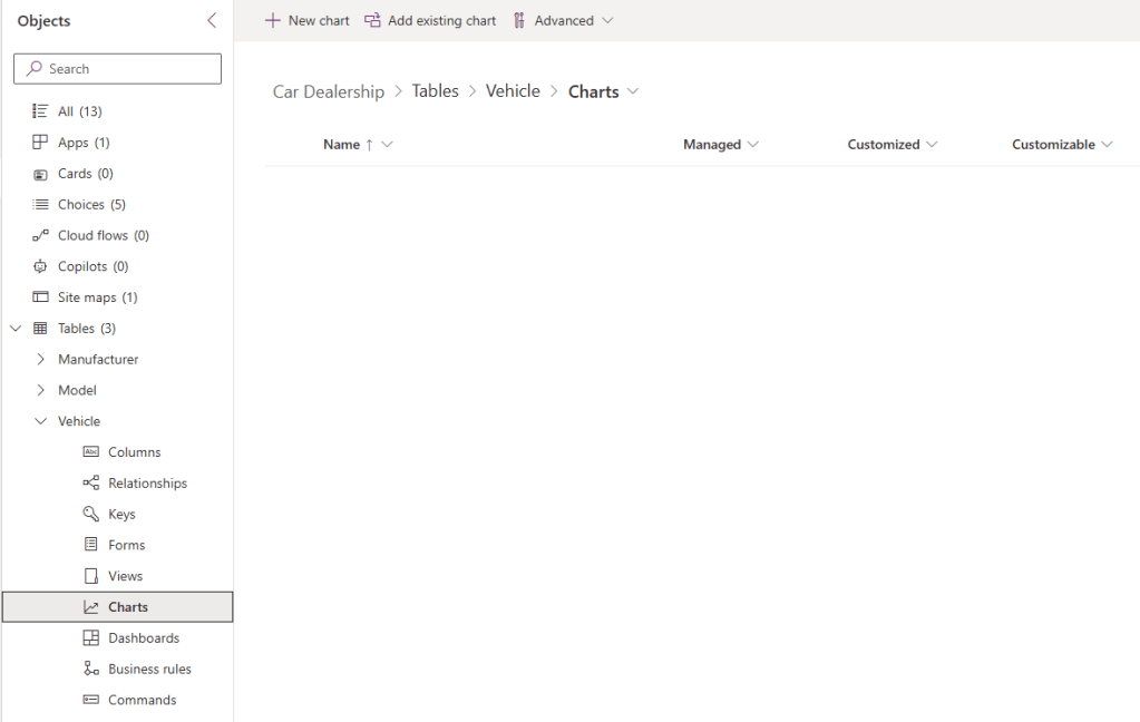
We begin from the solution view in our app – select Tables > Vehicle > Charts from the side navigation and click the + New chart button in the top ribbon.
This will open the chart creator in a new tab. We will fill in the following:
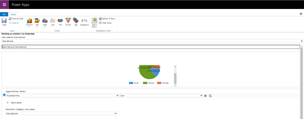
- Click Pie from the list of chart types
- View used for chart preview: Sale Vehicles
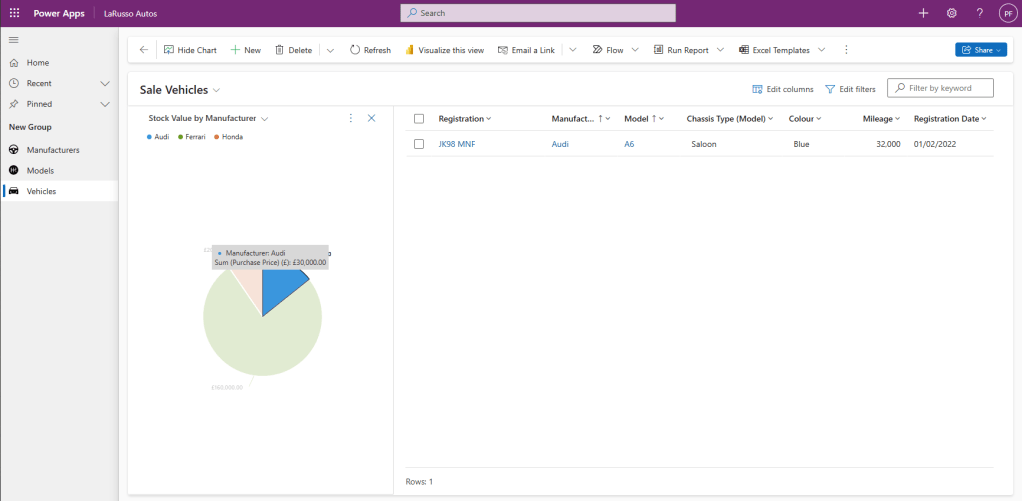
- Type Stock Value by Manufacturer (this box is for the chart name)
- Legend Entries (Series): Purchase Price
- Select Sum for the aggregate as shown
- Horizontal (Category) Axis Labels: Manufacturer
The click Save and Close. From the solution view, click + New chart in the navigation ribbon again. Fill in the new form screen as follows:
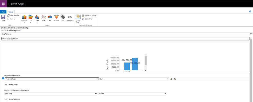
- Click Column from the list of chart types
- View used for chart preview: Sold Vehicles
- Type Vehicle Sales by Month (this box is for the chart name)
- Legend Entries (Series): Purchase Price
- Select Sum for the aggregate as shown
- Horizontal (Category) Axis Labels: Sale Date and Month
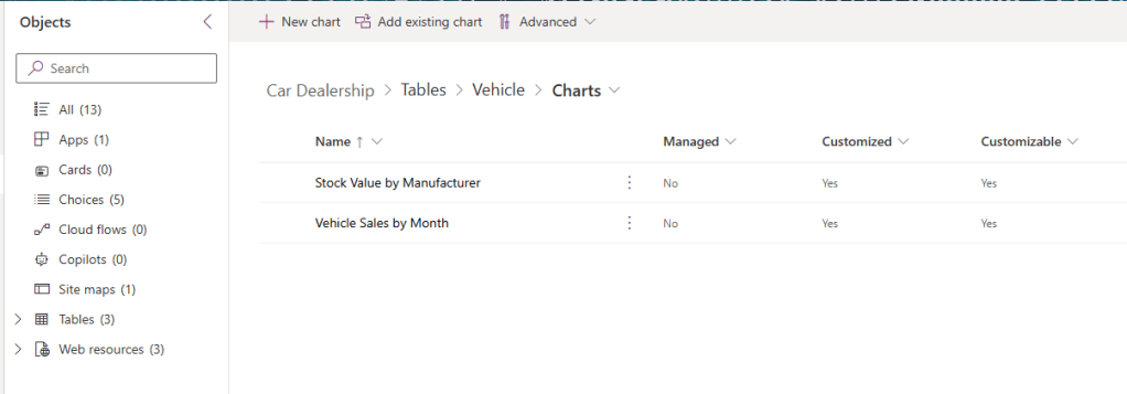
Again, click Save and Close. Refresh the solution view and we can see both charts are available.
Now if we run our LaRusso Autos app and navigate to the Vehicles screen, a Show Chart button is available in the top navigation. Click to view our charts.

Note that selecting a segment of our chart will drill down the values and update the displayed rows:
If we change our view from Sale Vehicles to Sold Vehicles our other chart will appear.


Leave a comment